20 августа 2017 г.
New packaging design
New packaging design.
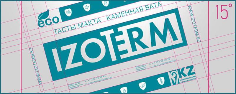
In addition to the logo and corporate identity, the company updated its packaging. Now the brand IZOTERM on the branded film has become larger and more readable. The slope of the design from the angle of the horizon of 15 degrees allows you to achieve the effect of movement and growth. This technique allows you to place more information on the same surface area as opposed to the old design.

Now the brand IZOTERM on the branded film has become larger and more readable.Insulation properties are reflected in the form of graphic easily understood illustrations. Now on the package posted company website. No matter how large the packaging is, it is impossible to tell everything that the client needs fully. To do this, we redesigned the site and placed on it all the necessary information, starting with certificates and prices, ending with a convenient catalogue with a filter for various properties of the products.